Downstate Donuts
Downstate Donuts isn’t just about donuts—it’s about playful flavors, real craft, and a brand that feels as original as its potato-based recipes. I partnered with the founder to refresh the identity, creating a system that’s warm, modern, and ready to grow.
Downstate Donuts
Downstate Donuts already had the magic: potato-based recipes, playful flavors, and a personality that felt genuinely its own. My job was to help the brand look as original as the product tasted. I partnered with the founder to refresh the identity, building a warmer, more flexible system that could grow across packaging, merch, signage, social, and everyday brand moments.
Role
Brand Designer
Date
July 2025


DSD 3.0
The first identity direction for Downstate Donuts focused on the product origin: farm fresh, made from potatoes, handmade, local, and simple.
The refresh kept the warmth of the original concept, but pushed it into a more playful, polished, and flexible world. I built out a fuller logo suite, custom assets, color palette, typography direction, packaging mockups, and brand applications designed to make Downstate feel as memorable as its donuts.
Turning Potato Donuts
Into a Brand World
I built a full set of guidelines to ensure consistency across platforms and future campaigns. This included rules for logo usage, color application, and typography, as well as digital asset templates for social media, email headers, and website visuals. I also organized a production-ready file system, making it simple for the brand to apply its identity at scale.


.png)


.png)

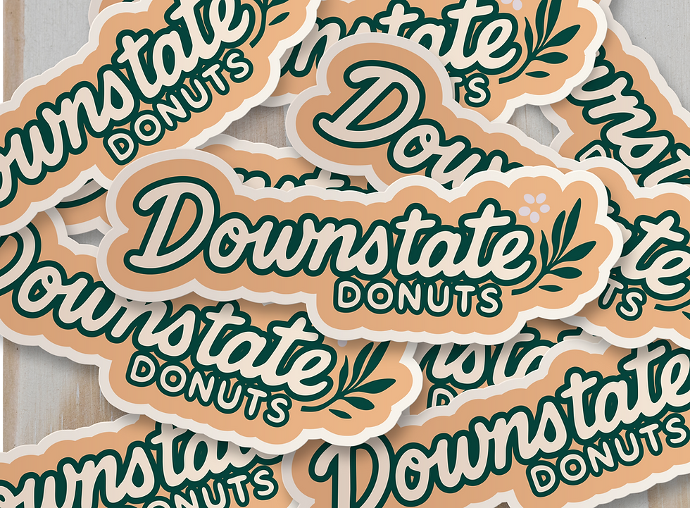


Brand in Action
I produced mockups to demonstrate how the identity comes to life across storefront signage, digital campaigns, and customer-facing experiences. These applications gave the founder a clear vision for how the refreshed system could expand into new retail, event, and wholesale opportunities.